
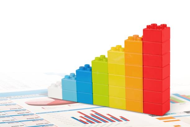
Stacked bar graphs are one of the best ways to depict broad trends and compare the makeup and distribution of categories within a dataset. Stacked bar graphs are different from regular bar charts because they can show more than one data series in a single bar. Each segment is stacked on top of the last one. This makes it easy to see how much each subcategory adds to the total value. For organisations, teachers, academics, and analysts, learning how to use stacked bar graphs means being able to get more information from data in a way that is easy to understand.
Knowing the Structure
A stacked bar graph has vertical or horizontal bars that are divided into coloured sections. Each section stands for a particular subcategory. The segments stacked inside each bar show the parts of the whole, and each bar stands for a distinct category or time period. The entire value for that category is shown by the cumulative height (in vertical graphs) or length (in horizontal graphs) of each bar. This two-layered picture makes it easier to compare the whole and the components.
When to Use Bar Graphs with Stacks
When you want to demonstrate both the total size of a category and how much each of its parts contributes to that size, stacked bar graphs are the best choice. For instance, in business, they can be used to show sales by product category and area. In schools, they can be used to illustrate how well students do in different topics by grade level. Stacked bar graphs can show vaccination rates by age and region in the field of public health. They are great for figuring out not only how one variable changes, but also how the parts that make it up vary over time or between groups.
Different kinds of stacked bar graphs
There are two main kinds of stacked bar graphs: absolute stacked bar graphs and 100% stacked bar graphs. The first type shows real numbers stacked on top of each other, which is helpful for figuring out the sizes of both the whole and the parts. The second kind makes all the bars the same height (typically 100%) to represent percentage contributions instead of raw values. The type you choose should depend on what you want to learn from your analysis. Use absolute if you need to compare whole quantities. Choose the 100% stacked version if you need to compare proportions.
Read Also: Crafting the Perfect Paragraph: Essential Tips for Readable Content
How to Make Stacked Bar Graphs Work
When making good stacked bar graphs, the most important thing is to be clear. There should be a distinct label on each part, either directly or with a legend. Use colours that are easy to tell apart and go well with palettes that are easy for colourblind people to see. It’s also vital to keep the segments in each bar in a reasonable arrangement, like stacking them from smallest to largest or putting comparable categories together. Don’t include too many segments or bars on the chart, because this can make it hard for people to see what’s going on.
Common Mistakes and How to Avoid Them
Stacked bar graphs can be misused or misunderstood if they aren’t carefully built, even though they have some good points. One common mistake is to add too many categories, which can make the graph hard to read and messy. Another problem is that the colours are not very good, which makes it hard to tell the pieces apart. Viewers can also get confused when portions are ordered differently across bars. Always remember that the more complicated the graph is, the harder it will be for your audience to interpret. Data visualisation is all about keeping things simple and consistent.
Tools and programs for making stacked bar graphs
There are many tools you may use to make stacked bar graphs. Some of them are simple spreadsheet applications like Microsoft Excel and Google Sheets, while others are more complicated data visualisation tools like Tableau, Power BI, and R (ggplot2). Excel makes it easy to make both absolute and 100% stacked bar charts. Tools like Tableau and Power BI let you customise and engage with your dashboards and business reports more, which is perfect for dashboards and business reporting. R and Python let developers and statisticians write scripts that give them full control over how things look and how data is processed.
How to Read Stacked Bar Graphs Correctly
To make sense of a stacked bar graph, start by looking at the entire height or length of each bar to see how big or little the overall trend is. Next, look at each section to observe how the subcategories affect or vary the totals. Be careful of optical illusions. Smaller parts may seem unimportant when they really contain important information. Data labels or tooltips can assist make exact values clearer, especially when the data is interactive.
Uses in Many Fields
Stacked bar graphs can be used in many different fields. They may keep track of how well their campaigns are doing across different platforms and demographics in marketing. In finance, they might show how much each product line costs or how much profit it makes. Stacked bars assist keep track of how many people get sick by age and gender in the healthcare field. Teachers use them to demonstrate test scores for different groups of students, while environmental experts use them to show how much resources are used or how much pollution there is. Because they are so flexible, they are great for creating stories with data from many different angles.
Best Ways to Use Engaging Visuals
To make interesting stacked bar charts, use data that has a purpose and design that is well thought out. Pick a colour scheme that fits with your brand or the concept of your presentation yet is still easy to read. To make it easy to compare, keep the sequence of the segments the same. Make sure your titles, labels, and legends are clear and to the point. Think about adding animation or interactivity to digital media to get Social Media Management Packages more involved. Always look at your graph as your audience would perceive it and make changes to it to make the most important points stand out.
In conclusion
To really grasp how to use stacked bar graphs, you need to know when and why to use them, as well as how to make them both obvious and useful. These graphs are a unique approach to show complicated, layered data in a way that makes patterns and trends easy to see. A well-made stacked bar graph can turn statistics into tales, which makes your data easier to understand, remember, and have an effect on. This is true whether you’re presenting to stakeholders, students, or the public.


